In previous videos and articles from our series on editing photos with your mobile devices, we have looked at using the phone’s editing suite of tools to do everything from cropping to making changes to the black point. In this tutorial, we are diving into making changes using the “Color Tools” – 4 settings that can really bring new life to your photos. Editing the Saturation, Vibrance, Warmth, or Tint settings can improve the richness and quality of your photos, so let’s look more closely at those.
Getting Started
This tutorial is based on the iPhone’s iOS 15, so if you have problems following along, check your operating system to see if you need to upgrade. If you aren’t sure how to do that, watch this short video.
Editing the Saturation
When you start tweaking the color settings of your photos, you’ll quickly see why they are called that. Saturation is the first one we are looking at and it refers to the intensity of a color. The more you increase the Saturation of a photo, the more vivid the colors will be. The lower the Saturation, the closer it is to gray.
It’s easy to imagine why you would want to increase the intensity of your photo’s color. I love a beautiful blue sky over green grass. Pushing up the Saturation would make those two colors more stunning.
But why would you want to lower the Saturation? Well, there might be an instance when you want to create a muting or calming effect by taking the vividness of the colors down a notch or two. It is important to know, also, that you don’t want to over saturate a photo because it would create an unnatural look.
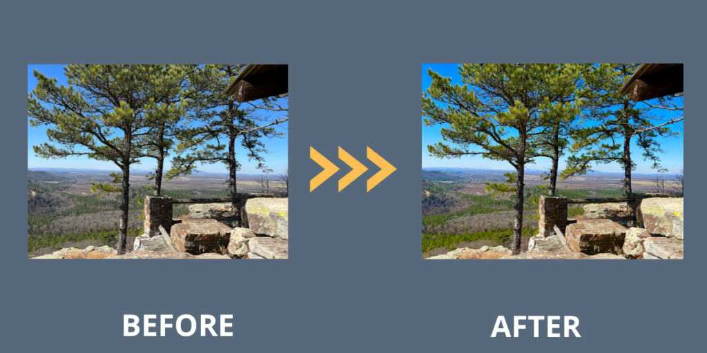
When I experimented with decreasing and then increasing the Saturation on a sample photo of a state park pavilion with blue sky in the background, I discovered that increasing the Saturation made the sky and the green branches of the pine trees more vivid.

Editing the Vibrance
One thing to keep in mind when you are making edits to your photos with the color tools is that Saturation is, well, sometimes too much! It’s easy to overdo it and create an unnatural-looking photo color-wise. But this is where the Vibrance tool excels!
The Vibrance tool can be considered your phone’s “smart” Saturation tool. Just like the Saturation tool, it can increase the vividness of your photo. But unlike the Saturation tool, it has a built-in algorithm that makes sure the overall toning of the image never seems to be too overly saturated.
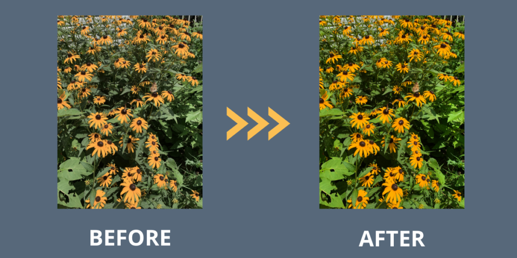
To show you what I’m talking about, I edited a photo of some Black-Eyed Susan flowers that had been taken on a cloudy day. The colors weren’t as vivid as I wanted them to be. I first experimented using the Saturation tool, but the result wasn’t natural-looking.
The tool that worked the best to bring out the colors of these blooms was the Vibrance tool. It increased the vivid colors of the blooms but balanced them against the green leaves.

Editing the Warmth
Adjusting the Warmth of your photo is really just increasing the temperature of the photo by adding a yellow or orange tint, or cooling down the temperature and colors by adding a bluish tint. The temperature of a photo affects the mood of the person looking at it, so you might consider increasing or reducing the warmth based on how you want your photo to make someone feel.
I experimented with a photo of a state park lodge that I shot during the “golden hour” just before sunset. Because of that, it already had a warm glow to it. Would increasing the temperature take it one step further?
First, I tested out what cooling the photo would do by changing the Warmth settings to the negative side of the slider. Then I slid the Warmth settings to the positive side and ramped up the temperature of the photo a bit. I really like the result!

Editing the Tint
The Tint tool just basically lets you add a green or magenta color tint to your photo. Drag the slider left (negative) to add a green tint or to the right (positive) to add a magenta tint. If you are unhappy with the way one of your photos is looking, it’s worth a quick bit of experimentation to see if adding a green or magenta tint can bring out the elements in your photo that you want to highlight.
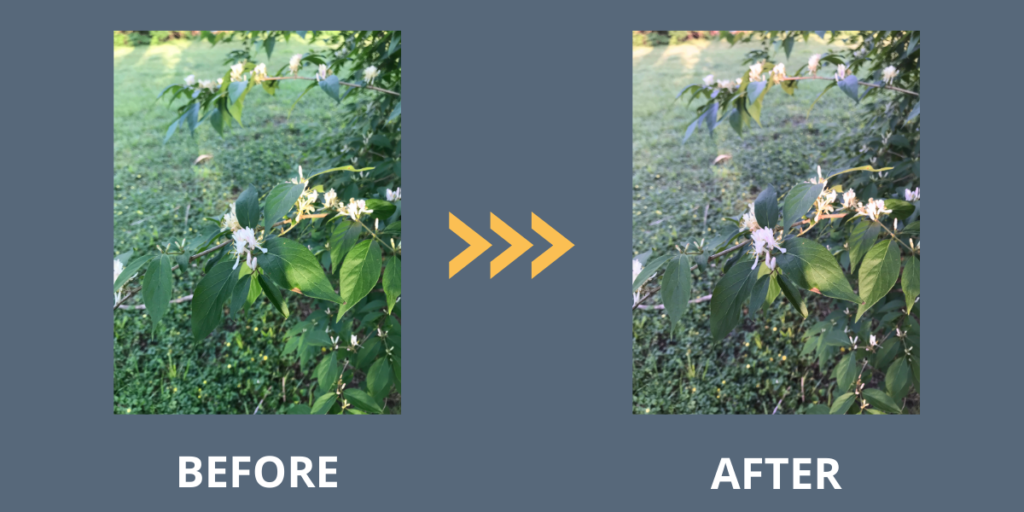
Take a look at what happened when I experimented with a photo of honeysuckle blooms. The original photo was so overwhelmingly green that I knew right away that adding a green tint (slide to the negative) would not lead to a good result! But surprisingly, adding the magenta tint (slide to the positive) brought out the white blooms and resulted in a better color balance overall.

For Our Android-User Friends
While we’ve been focusing on using the onboard photo editor for the iPhone, I know that so many of you take your photos with Android and Google phones. Even though I don’t own one of these, I haven’t forgotten you! I will always try to find a good online source for you to continue your learning. Here’s a good one.
Now It’s Your Turn to Experiment
I hope you have been experimenting with some of the new editing tools that we have shared in our series so far. Take some time soon to edit your photos using the settings for Saturation, Vibrance, Warmth, and Tint to see how they can make a difference. Happy editing!
As we continue this series on editing photos, is there something you want to learn? Please comment below and let us know! Thanks for reading.


Good day! This post couldn’t be written any better! Reading this post reminds me off my old room mate!
He always kept chatting about this. I will forward
this articlle to him. Pretty sure he will have a good read.
Thank you for sharing!
Thanks for reading!
Have you eveer considered publishing an e-book or
guest authoring on other websites? I havee a blog centered on the
same topics you discuss and would love to have you share some stories/information. I know my viewers would appreciate
your work. If you are even remotely interested, feel free tto
send me an e-mail.
Thanks for reading. I’m working on creating an ebook of this entire iPhone photo editing series that should be available soon.